
The Data Issue
Good morning, friends.
How is everyone feeling today?
I spent some time with the household chickens today, a small moment of joy in a difficult week.
This week’s newsletter is about data. Every day it seems like a new number is released: 1,200 students infected, $50 million invested, 183,000 deaths, 10.2% unemployment. The numbers are overwhelming, breathtaking, horrifying. But they are also useless. What can we do in the face of all that?
This week’s newsletter isn’t an answer or a hot take. But it does offer some different ways of looking at numbers, ways that we hope can lead us towards what we always aim to do: building community, improving access to information, and generating action.
— Hannah for the VFC
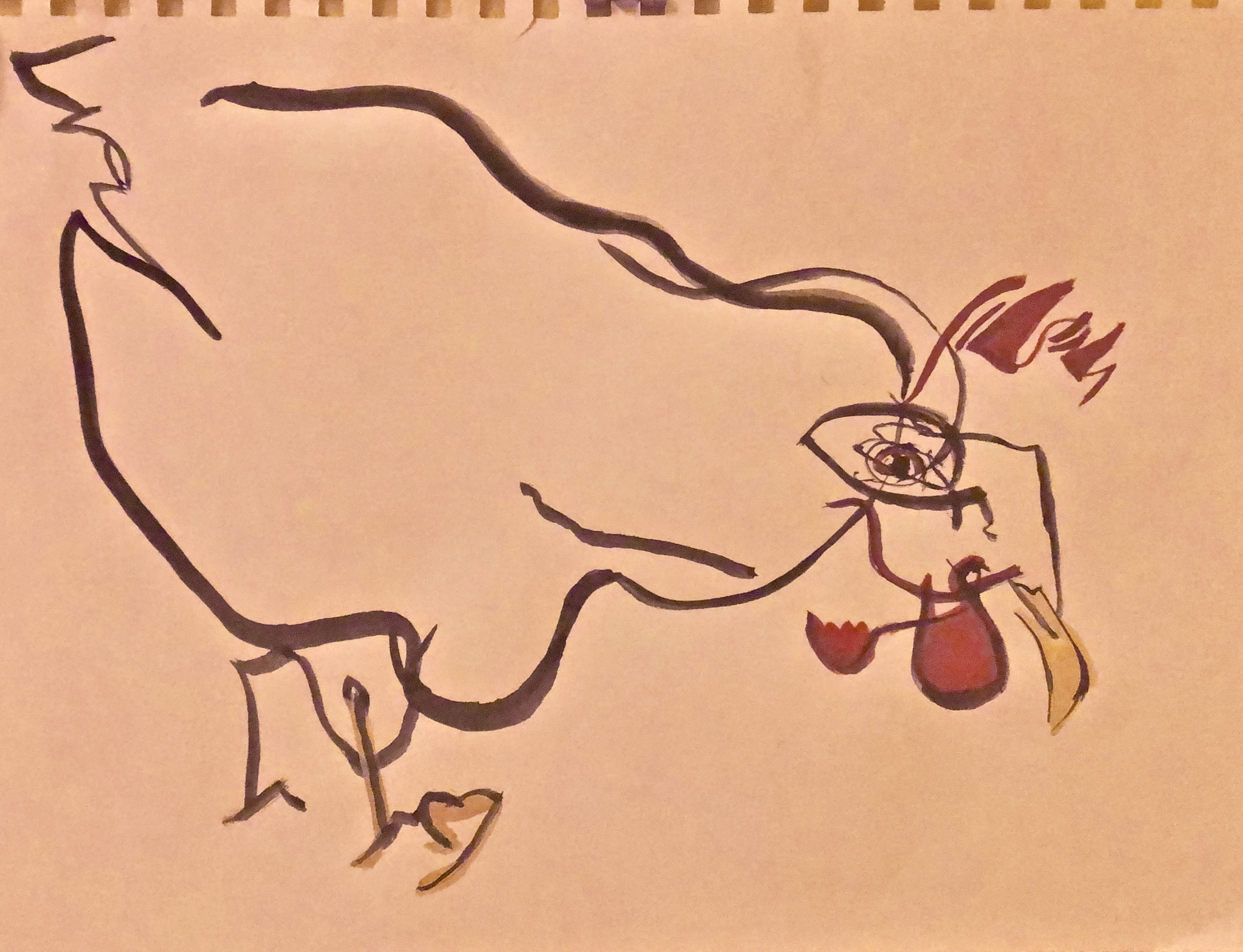
[Image description: abstract drawing of Duckbert, a chicken. By VFC resident artist Claire Chenette.]
Challenging power requires mobilizing data science to push back against existing and unequal power structures and to work toward more just and equitable futures.
— Catherine D'Ignazio and Lauren F. Klein, Data Feminism
How are you feeling, APFN?
Each week we’re checking in about feelings as the fall semester unfolds. We’ll be creating and sharing visualizations about our collective moods. And we’ll never make your personal information public. Read more about our community principles.
I’m just so.tired. today.
Thanks to everyone who participated in our survey from last week. We relate to so much of what you’re feeling.
I'm on the verge of a fucking freakout. But there are a lot of people who depend on me for emotional support, so I'm trying to keep it together.
Meaningful data visualization is slow work. As we build a project based on your responses, we want to take some time to acknowledge your participation and share a little of what you told us.
i’m an adjunct and i resent being asked to risk my life for a place that doesn’t give me health insurance. thinking about leaving academia at the end of this school year.
Even if you took the survey last week, please consider taking it again. As we get a sense of how we’re feeling in time and space, we’ll be building it into a larger project that we hope gathers together feelings, storytelling, and feminist data practices.
it turns out writing your dissertation during COVID is just as bad as having to teach during COVID.
Thank you again to everyone who continues to share your feelings with us.
I’m so angry.
We’re angry, too.
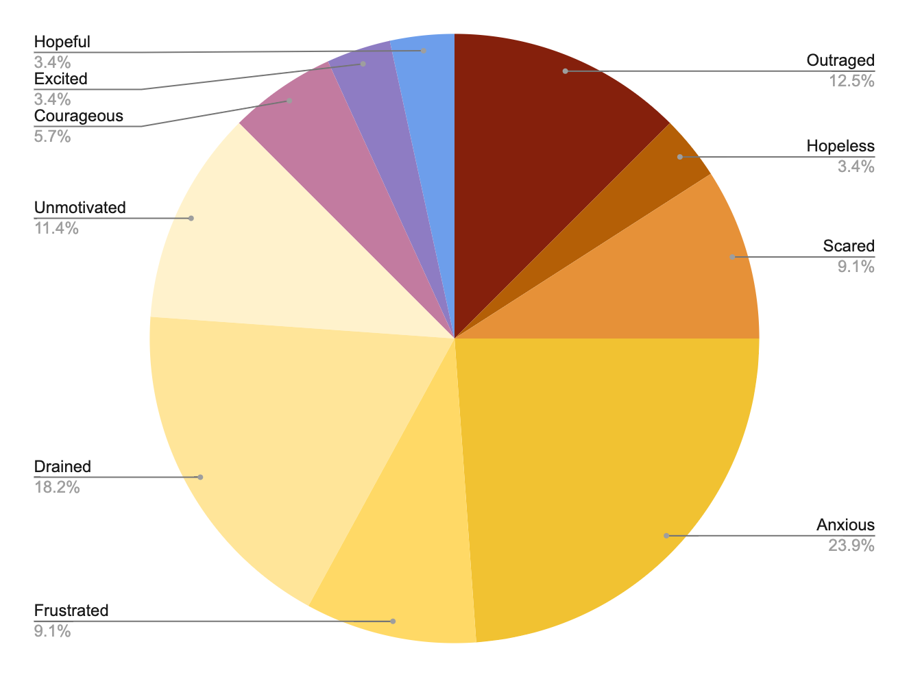
[image description: a pie chart showing that many people are feeling anxious (23.9%), drained (18.2%), scared (9.1%), and unmotivated (11.4%). But we are not without courage (5.7%) and we are not without hope (3.4%).]
Featured project: COVID Campus Timelines
How have student newspapers been covering the impact of the pandemic on college campuses? The VFC recently debuted two timelines that survey some of the coverage we’ve been collecting, in hopes of highlighting the range of stories we’ve come across in our developing database.
Hannah Alpert-Abrams created #COVIDCampus: What Happened?, a timeline documenting experiences across the United States at various kinds of colleges and campuses. Jim McGrath created a Greater Boston “case study” that documents the still-developing experiences in a part of the country with a particularly high concentration of colleges and students.
These timelines are by no means comprehensive. We hope that publishing them makes the stories present in our developing database more visible, as well as the gaps we are working to address in ongoing work. We view these timelines as storytelling tools that help the project and our audiences reflect on this unprecedented moment and the role student newspapers have played in documenting (and, at times, critiquing) reopening plans and sharing various perspectives of lives upended by the pandemic.
Many of the stories we have been reading and collecting are troubling. But we have also felt inspired by the many student journalists who have gone to great lengths to keep their peers informed and the administrators of their universities accountable.
We created these timelines with Timeline.JS, a free web-based tool created by the Knight Lab at Northwestern University. We were inspired to take a timeline-based approach to data by Bearing Witness: The COVID-19 & Inequality History Documentation Project, created by the Columbia University Center for Science and Society’s Cluster on Race, Inequality, and Health.
We chose to use a free tool in hopes that our work may serve as a model for people interested in telling stories about our project data or similar data. We’d also love to talk to students (particularly student journalists) who are thinking about data and digital storytelling in response to the pandemic’s impact on their universities and campuses. — Jim McGrath
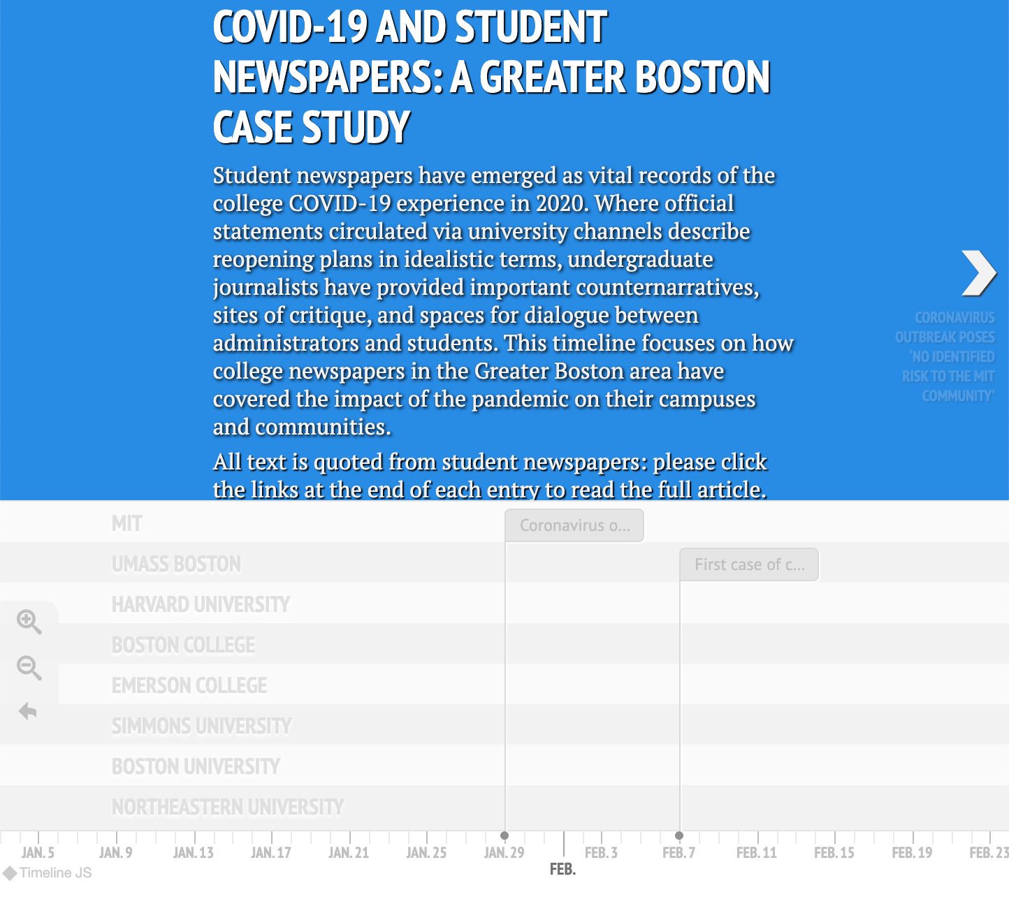
[image description: a screenshot of the “COVID-19 and Student Newspapers: A Great Boston Case Study” timeline, with news from MIT and UMass Boston, among other institutions.]
Counting Uncertainty
Uncertainty metrics do not translate well to public information, either in prose or in visualizations.
Instead we have numbers and graphs with clear, whole counts that are reassuringly concrete. […] We have many today who point to oversimplified national numbers to suggest that we can and should open up service sectors and lift shelter-in-place orders. Too often, the reported statistics leave out demographic data, obscuring the enormous racializing and class-based impacts of Covid-19 infections.
—Jacqueline Wernimont, The Grim History of Counting the Dead During Plagues
Recommended Viewing: Unsilenced Past
Marisa Parham and Kim Gallon talk about the line between data and storytelling and about the #COVIDBlack project in an interview hosted by Digital Humanities at Barnard College.
From data to solidarity
Occult decision-making by employers is not unique to academia. But returning to the seeming simplicity of our initial choice of data: creating a binary and asking whether or not institutions would open in the fall opened the way to other complex questions around academic labor, individual agency, institutional exploitation, privacy, and the very ability to access higher education in this country. This data is messy, and it is changing, but when we can remediate the constant flow of news, of promises made and broken, and make them into stable data points, we can use that stability (as temporary as it is) to create solidarity between academic workers across the country.
—Amanda Henrichs and the VFC, Visionary Futures and Making Change in the Academy With Data
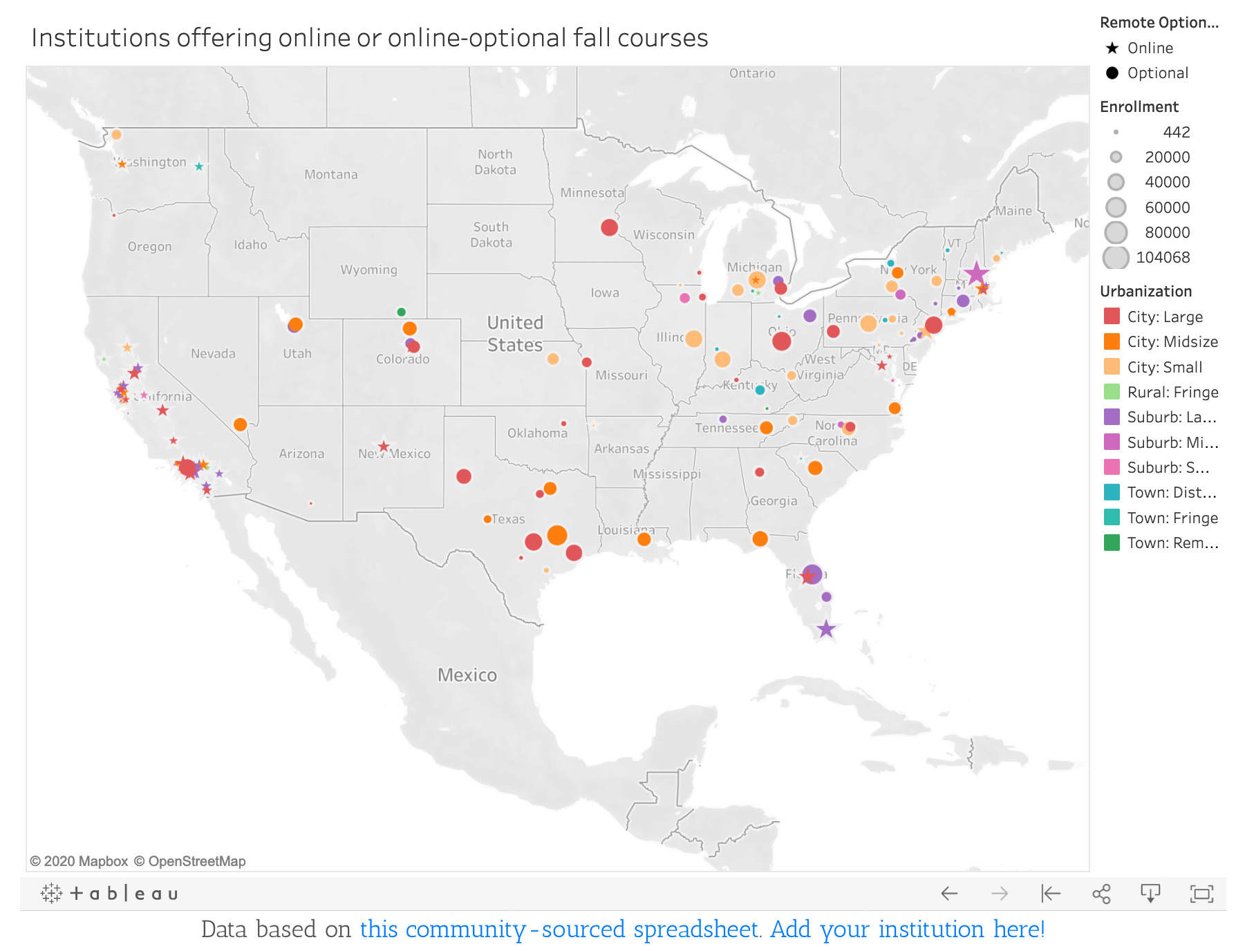
On this map from June 2020, stars show institutions with online-only instruction, and circles show institutions where online is optional. Size and color of symbols correspond to the size of institution and the surrounding urbanization, respectively.
Data Round-Up
How are people using data to talk about the coronavirus pandemic, especially on college campuses? Here are some projects we’ve been following.
Visualizing the Return to Campus at Scale
The COVID Tracking Project: compiling the latest numbers on tests, cases, hospitalizations, and patient outcomes from every US state and territory.
COVID Exit Strategy: Mapping change.
COVIDBlack: an early response taskforce on Black health and data.
College Reopening Plans and data visualizations from The Chronicle of Higher Education.
Reversals in Colleges' Fall 2020 Reopening Plans from Inside Higher Ed.
Inside Higher Ed on COVID-19’s Financial Impact.
The College Crisis Initiative, an initiative of Davidson College to learn how colleges and universities innovate in a crisis mindset.
K-12 School Closures, Quarantines, and/or deaths by Alisha Morris. Read about the project on NPR.
Karen Kelsky of “The Professor is In” on hiring freezes.
Bearing Witness and Rewriting the Narrative
Bearing Witness, documenting and interpreting the events of the pandemic, by the Columbia University Center for Science and Society’s Research Cluster on Race, Inequality and Health.
Digital Narratives of COVID-19, a data collection project led by the University of Miami’s Digital Humanities team.
Just One Day: a choose-your-own-adventure campus reopening game by Cait S. Kirby.
Advocating for Change and an Alternate Future
Accessibility policy statements for return to campus during the pandemic from Bess Williamson.
“COVID-19 Event Risk Planning Tool” from Georgia Tech.
Humanist Mutual Aid, an initiative to bring together workers in higher education for mutual support from Princeton University.
Have something you’d like us to share? If you know of a project relating to advocating for better life & labor policies on college campuses, please send it along. We’re also happy to hear from you if you have a short story, interview, profile, or other piece you’d like us to include in a future newsletter.
email visionaryfuturescollective@gmail.com
A music video by the VFC’s resident artist Claire Chenette.